In today’s educational landscape, it has become more important than ever that all students have equal opportunities to learn and succeed. For those with dyslexia, a common learning disability, the journey through education can be especially challenging.
One often overlooked aspect of making learning materials more accessible for individuals with dyslexia is the choice of font. In this article, we’ll explore how the right typeface designed for dyslexia can make a meaningful difference in reading comprehension and overall academic performance.
What is Dyslexia and How Does it Affect Reading?
Dyslexia is a common learning condition that affects approximately 10% of the UK population [1]. Despite normal intelligence, it primarily impacts a person’s ability to read, write, and spell. For dyslexic people, text can appear distorted, letters seem to move or flip, and words can blur together.
These visual challenges can make reading exhausting and frustrating, and some fonts are difficult to read for those with dyslexia.
Why are Fonts Important for Readers with Dyslexia?
The right typeface can drastically improve readability for people with dyslexia. Fonts designed with accessibility include specific features that help alleviate common reading difficulties. These dyslexia-friendly fonts can:
- Reduce letter confusion: By using distinct shapes for commonly confused letters like ‘b’ and ‘d’ or ‘p’ and ‘q’.
- Improve letter-spacing: Adequate spacing between letters prevents them from appearing to run together.
- Enhance word recognition: Clear, well-defined letter shapes make it easier to identify words quickly.
- Decrease visual stress: Certain font designs can reduce the visual strain associated with reading.
What Makes a Font Dyslexia-Friendly?
A few key characteristics define fonts that are accessible for individuals with dyslexia [2]:
Sans-serif design
Typefaces without decorative flourishes are generally easier to read. Sans-serif fonts, with their clean, simple lines, reduce visual clutter and make individual letters more distinct. Fonts like Arial, Helvetica, and Open Sans are popular sans-serif options.
Unique letter shapes
Each letter should have a distinct form to prevent confusion. This is important for letters that are commonly mistaken for each other, such as ‘b’ and ‘d’ or ‘p’ and ‘q’. Special fonts for dyslexia often have straightforward letter shapes to reduce confusion between similar letters.
Adequate spacing
To improve clarity, both letter and word spacing should be generous. Ample spacing helps prevent letters and words from appearing to run together, making it easier for dyslexic readers to distinguish individual characters and words.
Weighted bottoms
Letters with slightly heavier bottom halves can help anchor the text and prevent perceived movement. This design feature provides a stable baseline for the text, reducing the likelihood of letters appearing to float or move.
Varied letter heights
Differing ascenders and descenders (the parts of letters that extend above or below the main body) can help in letter recognition. This variation in letter shape helps readers differentiate between similar letters more easily.
Which Fonts are Best for Readers with Dyslexia?
While individual preferences vary, several typefaces have been specifically designed or identified as best for people with dyslexia. Here’s a list of some of the most dyslexia-friendly fonts:
- OpenDyslexic: An open-source font with bottom-heavy letters and unique shapes to enhance readability.
- Dyslexie: Developed by a graphic designer with dyslexia, this font includes several important accessibility features.
- Comic Sans: Surprisingly, despite its casual appearance, it’s often favoured by dyslexic readers due to its distinct letter shapes.
- Arial: A widely available sans-serif font with clean, simple designs and generous letter spacing.
- Verdana: Another sans-serif font considered dyslexia-friendly due to its clear, distinguishable letters.
- Calibri: The default font in many Microsoft applications, Calibri is considered accessible for individuals with dyslexia.
- Century Gothic: This font’s simple letter shapes make it a good choice for dyslexic readers.
- Open Sans: Another popular dyslexia-friendly font, Open Sans, is free to use and offers excellent readability.
- Helvetica: While not specifically designed for dyslexia, Helvetica’s clean design makes it easier on the eye for everyone.
How Can Schools and Teachers Implement Dyslexia-Friendly Fonts?
Including accessible fonts in educational materials can make a big difference in students’ learning experiences. Schools can start by using these typefaces in handouts and worksheets, ensuring that printed materials are more readable for all students. Providing materials with adjustable font options for digital resources allows students to choose what works best.
Installing dyslexia-friendly fonts on school computers is another option for helping students use these typefaces in their work. Dyslexia-friendly planners are also a great way to enhance people’s learning experience.
Allowing students to choose their preferred fonts for assignments also empowers them and improves their engagement with the material. The British Dyslexia Association recommends using font sizes between 12 and 14 points for optimal readability.
The Impact of Dyslexia-Friendly Fonts on Learning Outcomes
Studies have shown that using dyslexia-friendly fonts can significantly improve reading speed, comprehension, and overall academic performance for students with dyslexia. Research indicates dyslexic students reading texts in specially designed fonts often make fewer errors and read more quickly than standard fonts.
These improvements can lead to:
- Increased confidence in reading tasks.
- Better retention of information.
- Reduced fatigue during extended reading sessions.
- Enhanced participation in class discussions.
- Improved performance on written assignments and exams.
By implementing dyslexia-friendly fonts, educators can create a more inclusive learning environment that supports the success of all students, regardless of their reading abilities.
Combining Dyslexia-Friendly Fonts with Other Accessibility Strategies
While using appropriate fonts is crucial, it’s important to remember that it’s just one part of a comprehensive approach to supporting students with dyslexia. To maximise the benefits of dyslexia-friendly fonts, consider combining them with other accessibility strategies:
Colour and Contrast
Use high-contrast colour combinations for text and background. Dyslexic readers often prefer black text on a cream or light yellow background.
Text Formatting
- Use larger font sizes (12-14 points for general text, 16-18 points for headings)
- Avoid italics and underlining, which can make text appear to run together
- Use bold for emphasis instead
Page Layout
- Keep lines of text short (50-70 characters per line)
- Use wide margins and plenty of white space
- Align text to the left, avoiding justified text, which can create uneven spacing.
Digital Accessibility
- Provide text-to-speech options for digital content
- Allow users to customise font size, type, and colour settings on digital platforms
By implementing these strategies alongside dyslexia-friendly fonts, educators can create a more inclusive and effective learning environment for all students, particularly those with dyslexia or other reading difficulties.
How Can Penstripe Help with Dyslexia-Friendly Learning Materials?
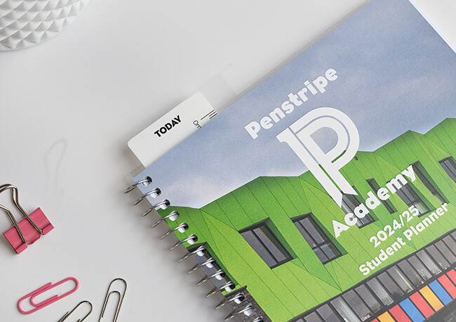
At Penstripe, we are committed to creating inclusive educational products that cater to all learners, including those with dyslexia. Our range of customisable student planners, including school exercise books and learning and well-being journals, are designed to enhance the learning experience for students with reading difficulties while promoting an inclusive environment for all.
Our customisable student planners feature:
- A variety of dyslexia-friendly font options.
- Tailored layouts for improved visual organisation.
- Customisable content to support specific learning needs.
By choosing Penstripe products, schools provide their students with the tools that support learners with reading difficulties and foster an inclusive learning environment. Our products aim to make all written communication easier on the eye for everyone, including those with dyslexia.
Get in touch
Contact us regarding our wide range of bespoke student planners and other high-quality learning resources designed to address the challenges faced by dyslexic readers and improve their overall reading experience.
Sources
Source 1: https://www.bdadyslexia.org.uk/dyslexia#:~:text=Ten%20percent%20of%20the%20population%20are%20believed%20to%20be%20dyslexic
Source 2: https://www.bdadyslexia.org.uk/advice/employers/creating-a-dyslexia-friendly-workplace/dyslexia-friendly-style-guide#:~:text=Readable%20fonts,may%20request%20a%20larger%20font.